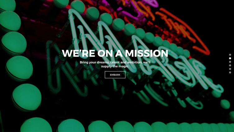
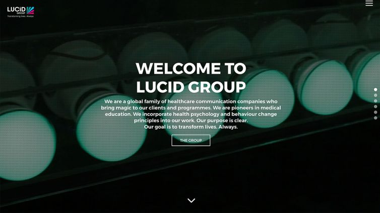
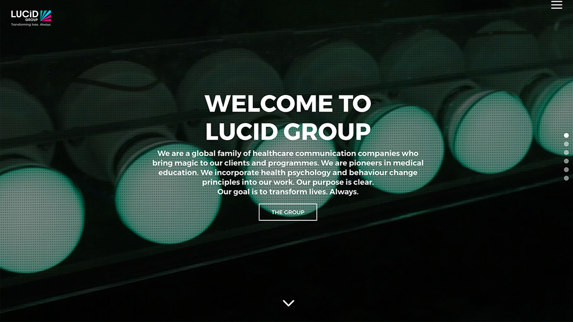
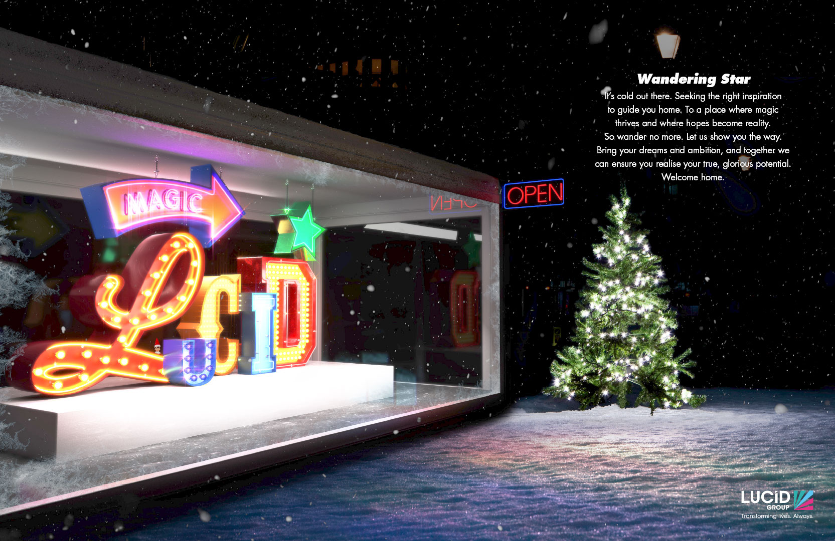
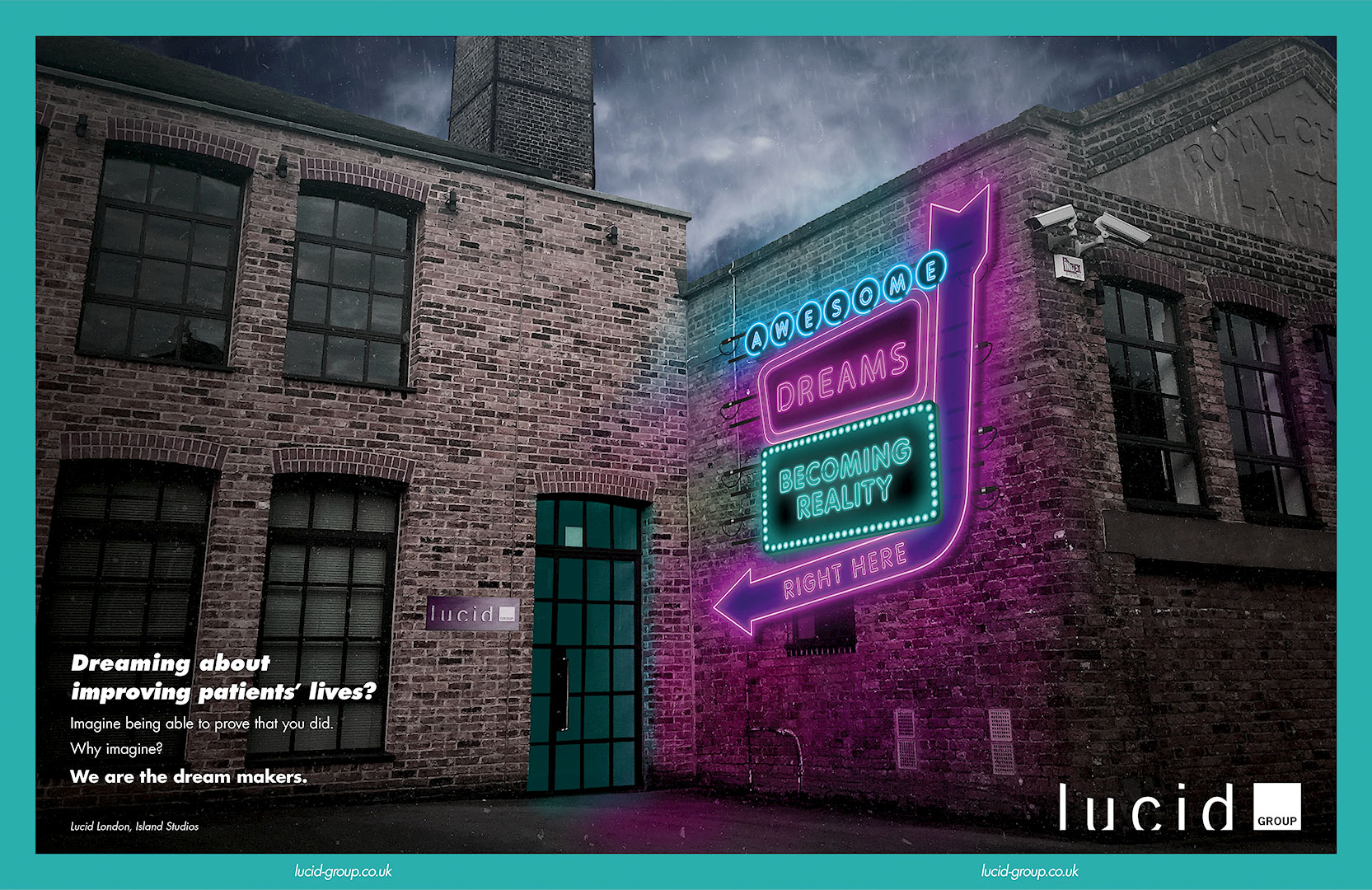
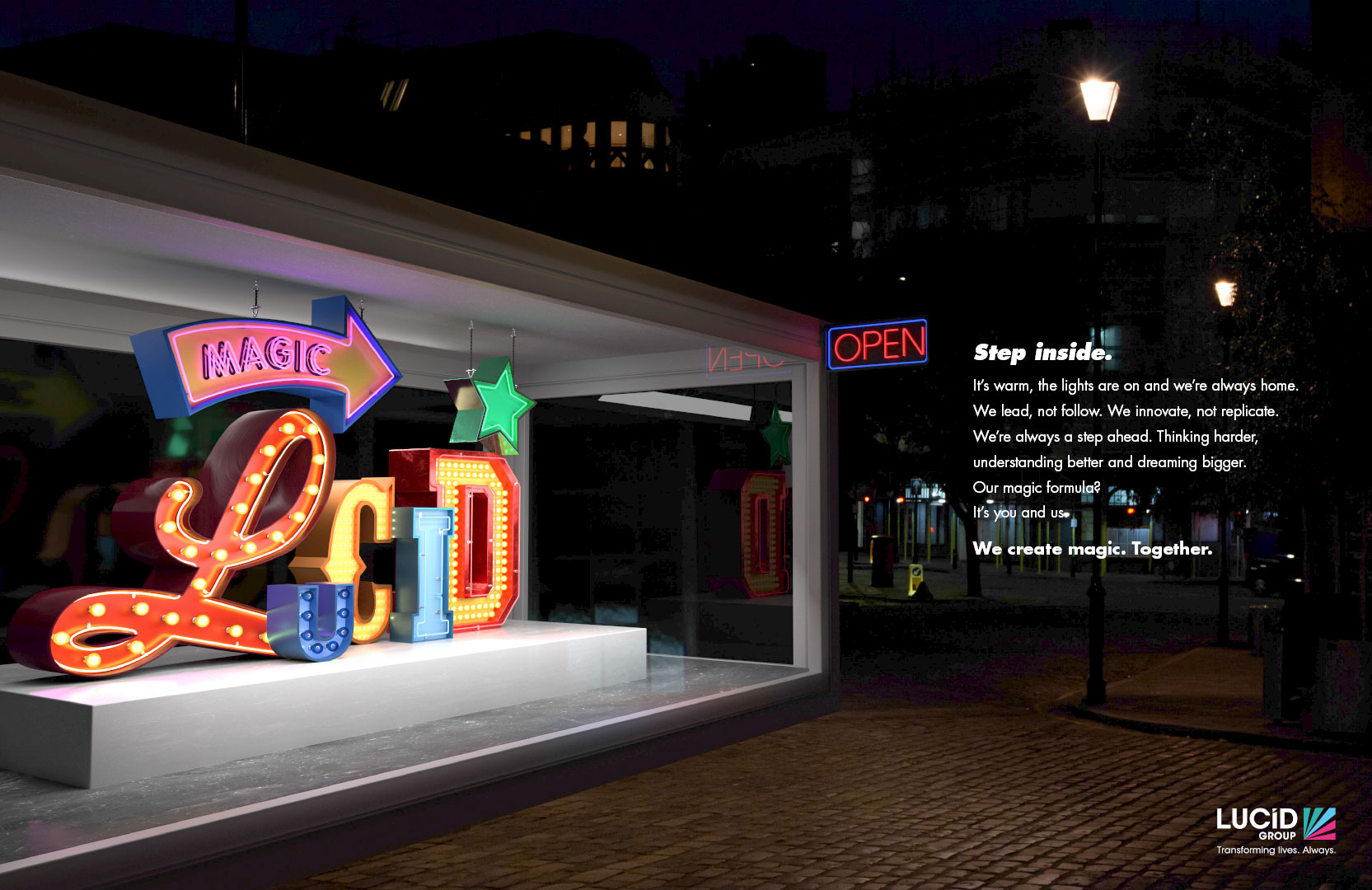
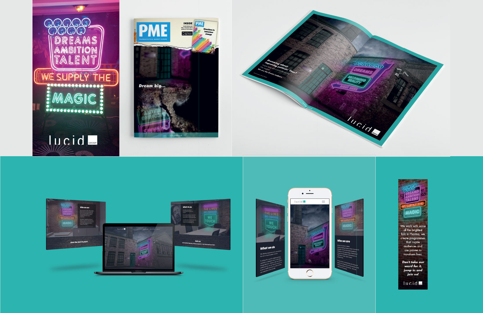
Lucid was an award-winning med-ed agency, who had been successful for 11 years. They decided it was time for a brand refresh.
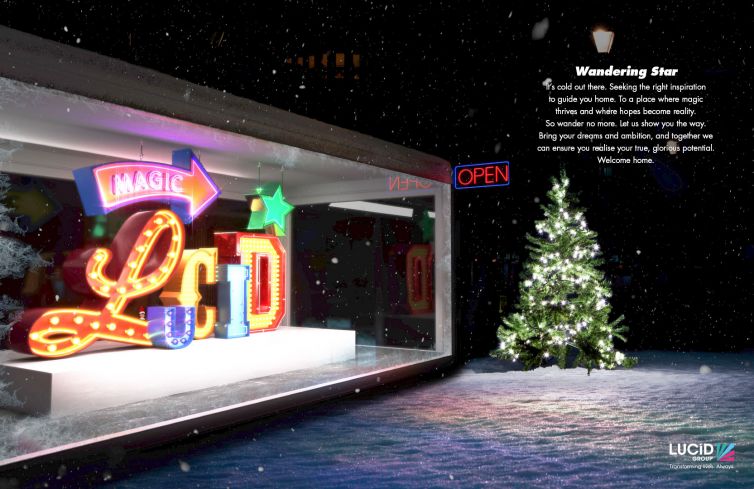
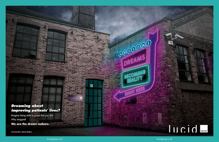
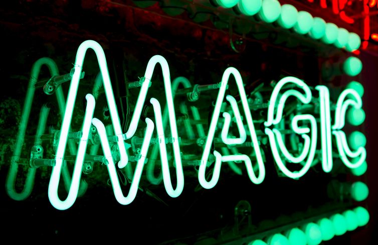
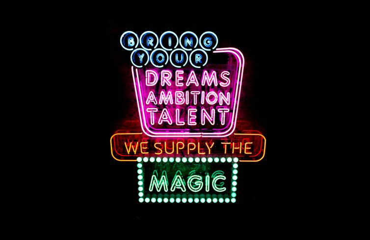
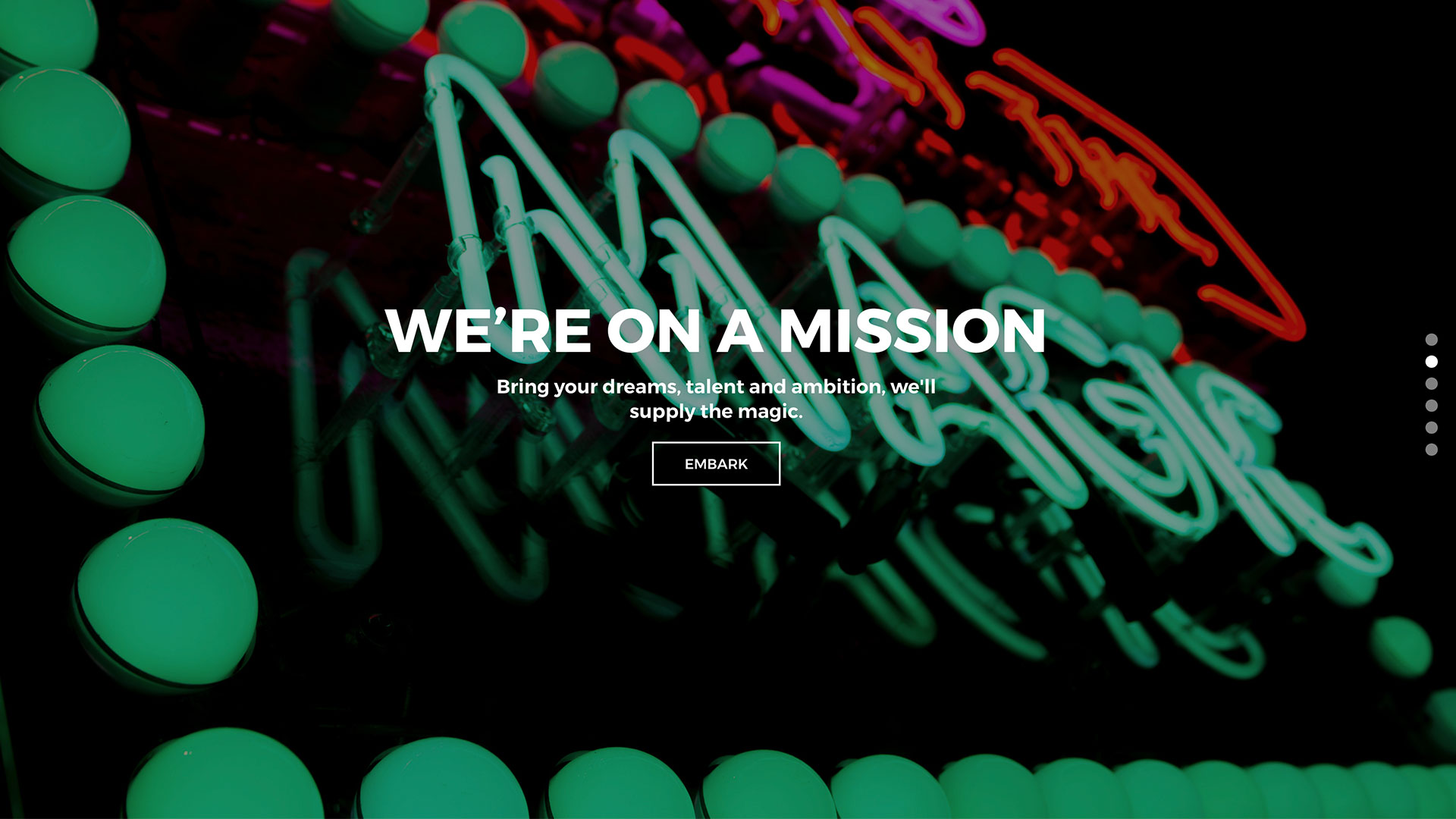
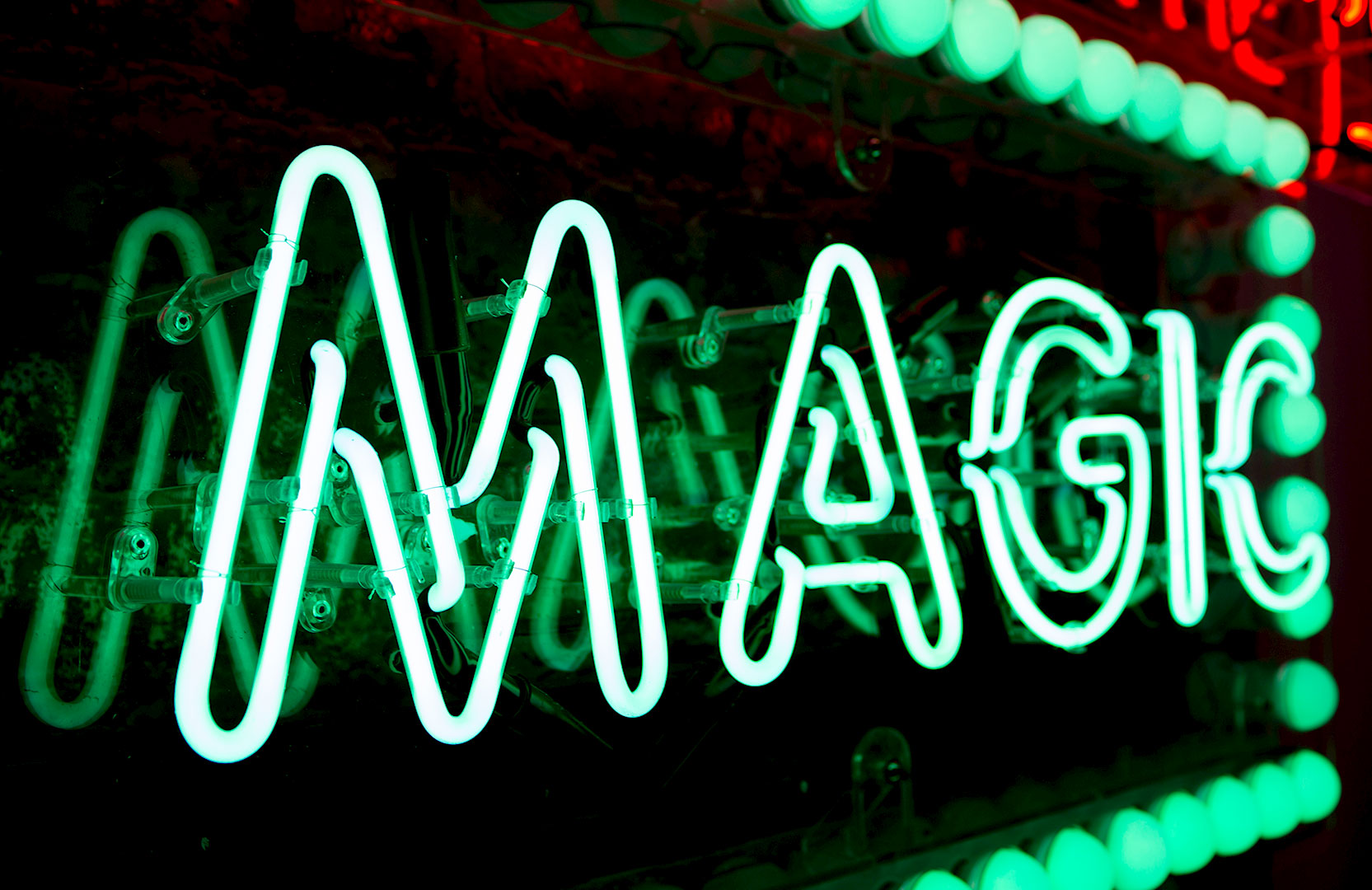
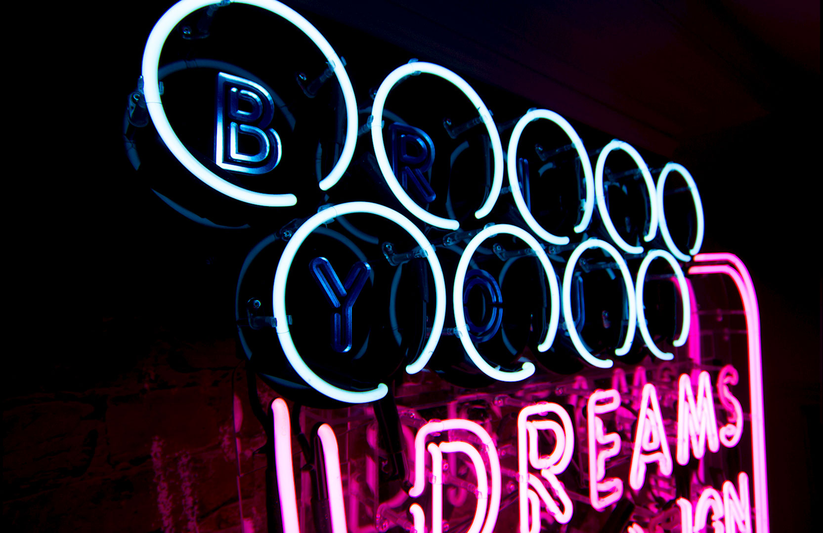
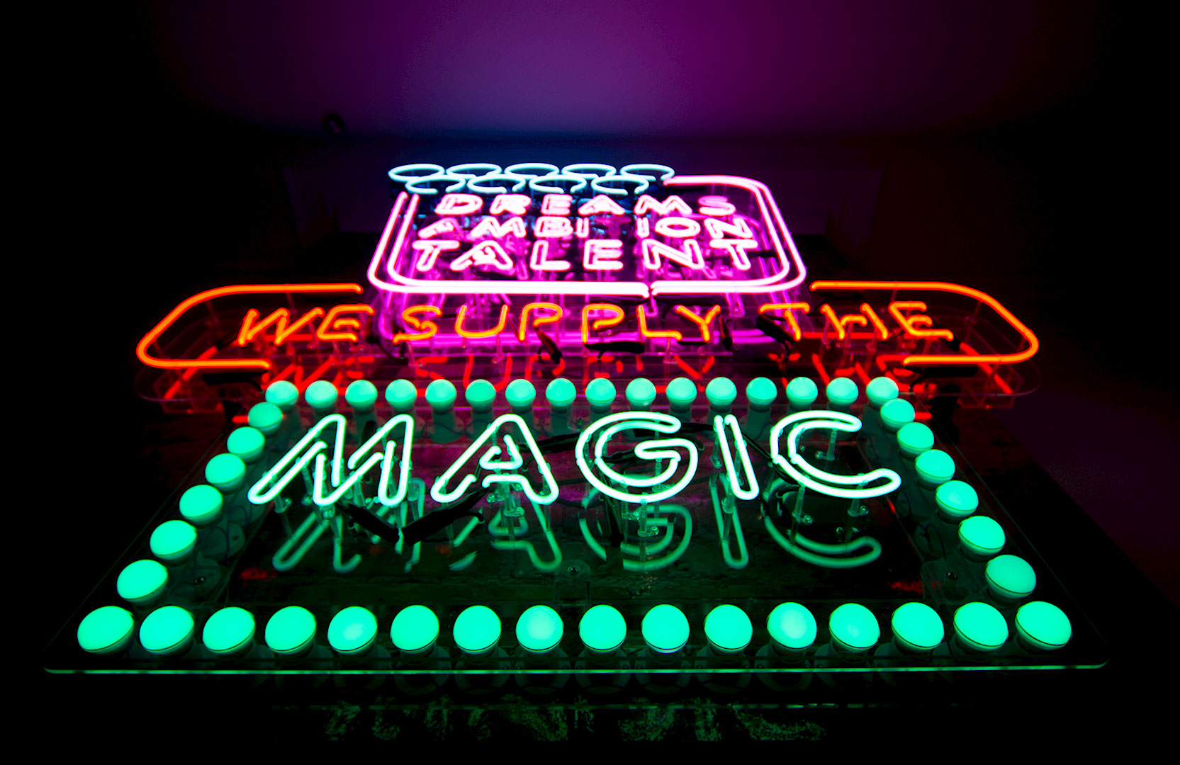
Focusing in on the dream of making patient’s lives better, and building on the proposition of bringing the magic! With that in mind, the key part of the visual language came from designed neon lights, with key brand messages. The logo was redrawn to include the coloured ‘beams’ each representative of a sub-brand beneath the group, but in a conceptual way, representing the light and magic that Lucid brings.


